
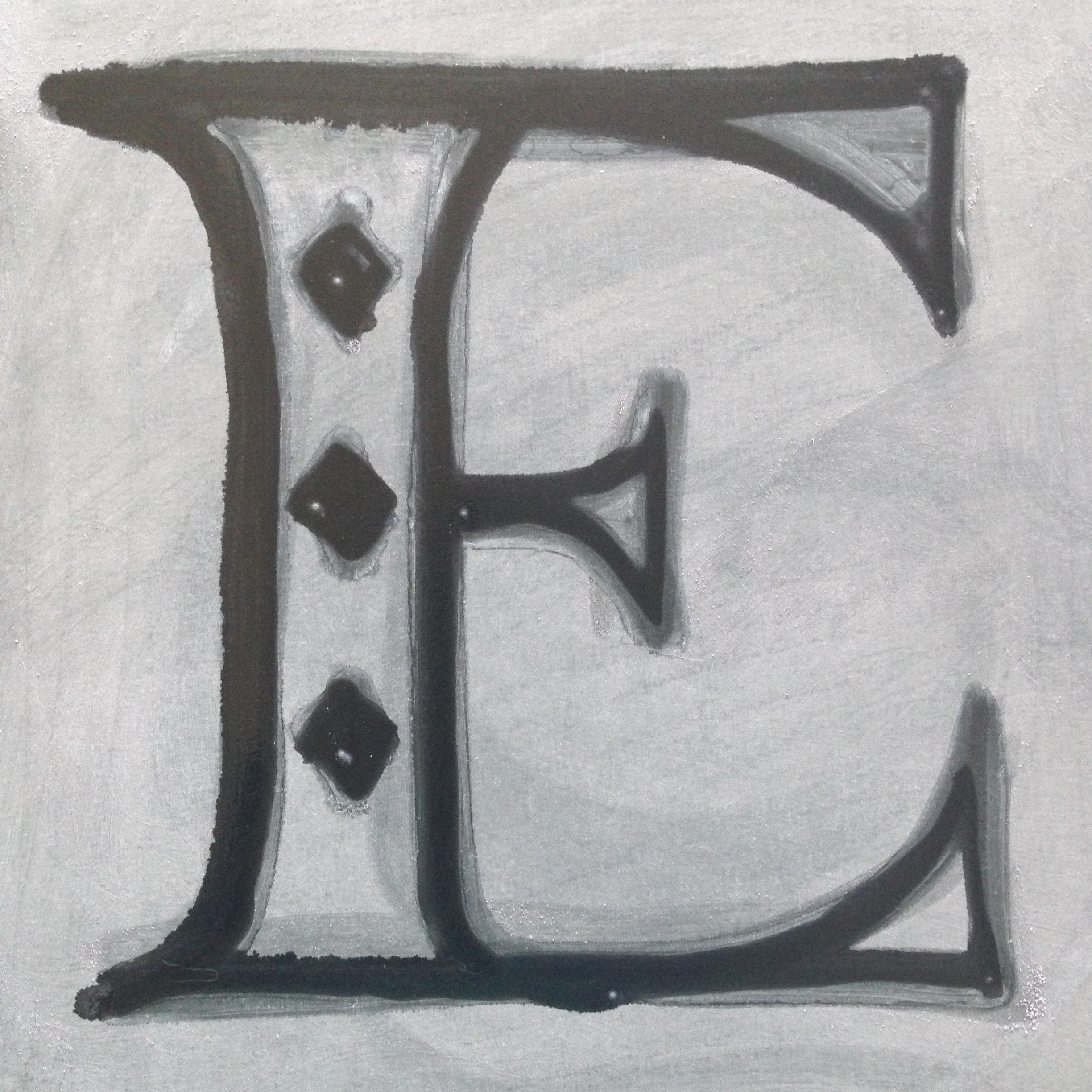
Letter F

As Mitch has been a bit busy, he has momentarily bowed out of the letter challenge. I am still going to continue, so look forward to seeing my posts here. The letter f above links to a short film of the flames in action. For being birthday candles, they were really hot against the foil! The actual letter is formed using a block of foam, which was quite difficult to cut without the proper tools. From there, I covered everything in foil and formed the “flowers” that hold the birthday candles.
Letter E
Coming up with a concept for the letter E was anything but easy. Mitch had a bit of a creative block so we delayed by one week, which ended up working out well since I had to focus on my final calligraphy project.
For me, inspiration hit when I realized that erase starts with an “e,” and I wondered how I could show erasure creatively. I thought of using eraser shavings, but I realized that it would be even better to use a chalkboard. I put chalk over the entire board and used a wet Q-tip to erase the letter e into it. The chalk dried over again leaving a somewhat ghostly line that was quite unattractive. To remedy the situation, I dipped the Q-tip into soapy water and tried again. It gave me more time to take my photograph, but I still had to work quickly. I think it turned out quite nicely, and I look forward to the letter f.
As always, you can check out all of the entire alphabet challenge on Storify.
Joanna Davidovich’s Monkey Rag
When I first ran across the title Monkey Rag on Cartoon Brew, I was intrigued, but too busy to watch the animated short. It resurfaced on Laughing Squid, and I am so glad I had a moment to check it out! Davidovich’s animated Monkey Rag is so exciting and nostalgic to behold. With the plethora of 3D and CGI work, it is a relief to see traditional animation. What do you think of the short? Hit the jump for a behind the scenes video as well as a pencil animation. Learn more about Davidovich and her work on her site.
Letter D
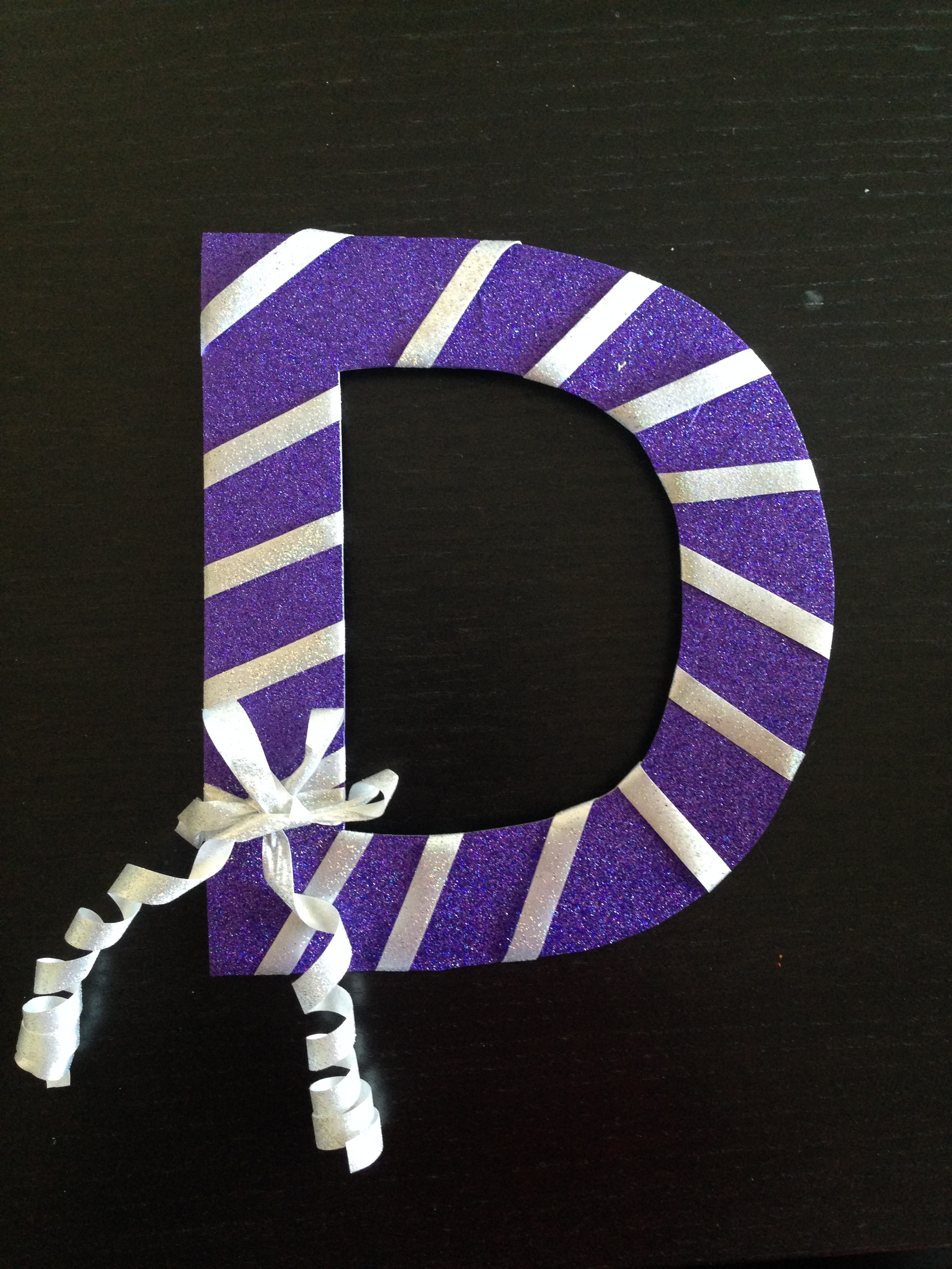
The letter D is the first one I’ve been a bit disappointed with. It is not due to the outcome, I think dazzle was a fun idea. The issue I faced with this letter is that the original concept I wanted to follow was making the letter D look like a disco ball. However, the time limit and my busy schedule made it impossible.
There are no progress photos this time. I didn’t feel that a huge explanation was necessary. I used a glittery gift bag to give the letter D some dazzle without the mess of loose glitter. Then, I wrapped ribbon around the D in diagonals. It’s a simple idea that would’ve been a lot more exciting if I could have made a disco D. You can check out Mitch’s de“light”ful, screenprinted letter D on Twitter.
I mentioned this last week, but there is a storify with all of the letters if you want to see them in one place. This letter was delayed one day in terms of posting due to the holiday weekend. The letter E will be ready on Sunday, so check #myletterhalf to see what Mitch and I come up with.
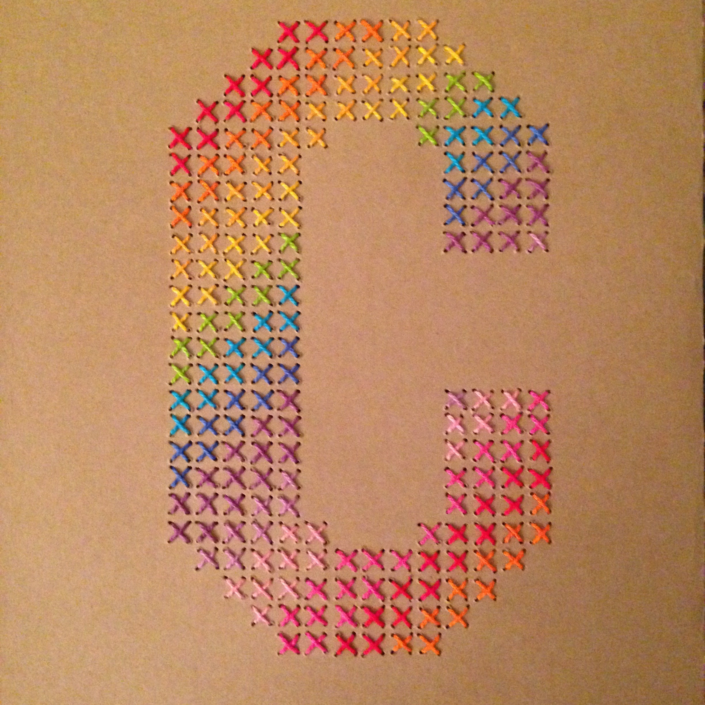
Letter C

Continuing with the alphabet challenge, Mitch and I unveiled our letter C’s yesterday afternoon. I think they are both strong pieces, so I am excited to see how this will continue.
As always, I have a little about the process. For C, I thought of colors and cross-stitch. To make my life easier, I created a grid of x’s in different colors so I knew which color string to use at different points in the letter. Since I used paper, I went ahead and stabbed holes into the surface using an awl before pulling the needle and thread through (if you’re wondering why, this kept the paper from ripping). My final C is below and you can check out Mitch’s C via Twitter. Because he’s awesome, he also aggregated the challenge into a storify, which you can follow moving forward.
We’ll be back Sunday with the letter D.
AIGA Design Salon: Freelancing
Since last year, I have kind of made it my business to volunteer at AIGA DC’s Design Salons. They are intimate, pertinent discussions about the design industry. Although this occurred a few months ago, I believe the information is relevant for everyone at any time in their career. Heather Miller-Cox of MillerCox Design provided six, strong points regarding freelancing:
- Pick a swim lane: Choose a specialty that you are comfortable with to help narrow your competition. This is scary because we often juggle as many hats as possible to appeal to a broad audience, but it can be more beneficial to find a niche market. Don’t let this keep you from working outside of your specialty—you can definitely do other work—but don’t get stuck working on projects you do not enjoy.
- Consider your mission carefully: To give your business a direction, decide whom you wish to serve. Cox posed this question, “Who do you want to be a hero to?” Answering that question will aid you in deciding what your core values are, and make it easier for your employees to understand your purpose.
- Develop a marketing strategy: Don’t expect your clients to automatically know who you are and what you do. Decide how you will market yourself and do it. It might be helpful to have a tagline, something simple that explains your purpose easily and clearly. It can also work as a jumping off point to pitch your business.
- Block time to network: Nothing is as important as knowing your field. Communicate with others in the industry and share best practices. It can also bring in new business as your network might be able to suggest you for a project if they cannot handle the workload or know you would do it best.
- Take coaching classes: Being able to design is one thing, but leading a business is another one. Learn how best to lead your company. One suggestion Cox made is to look around clientattraction.com (and you can check the closing resources at the end of this post for more on coaching).
- Invest in your business: Don’t just do work—become more of a consultant and less like a commodity. Educate your clients, and they will become the clients you want.
There were a few other takeaways from the discussion that I will quickly run through. One of the most uncomfortable things about freelancing (at least, in my opinion) is dealing with pricing. Two very good sources can help you out: The Graphic Artists Guild’s Handbook: Pricing and Ethical Guidelines and Jessica Hische’s post “The Dark Art of Pricing”. When you are expanding your business, make sure to put a system in place for your process—it’s even better if you can brand your process and name it. Lastly, if you cannot handle the role of Human Resources manager, hire a consultant. It will give you time to focus on other things and keep your business moving as it should.
Closing resources to research: E Myth, Built To Sell, Shel Perkins, and Cameron Foote.
Do any of you work freelance? Are there any points you would add?
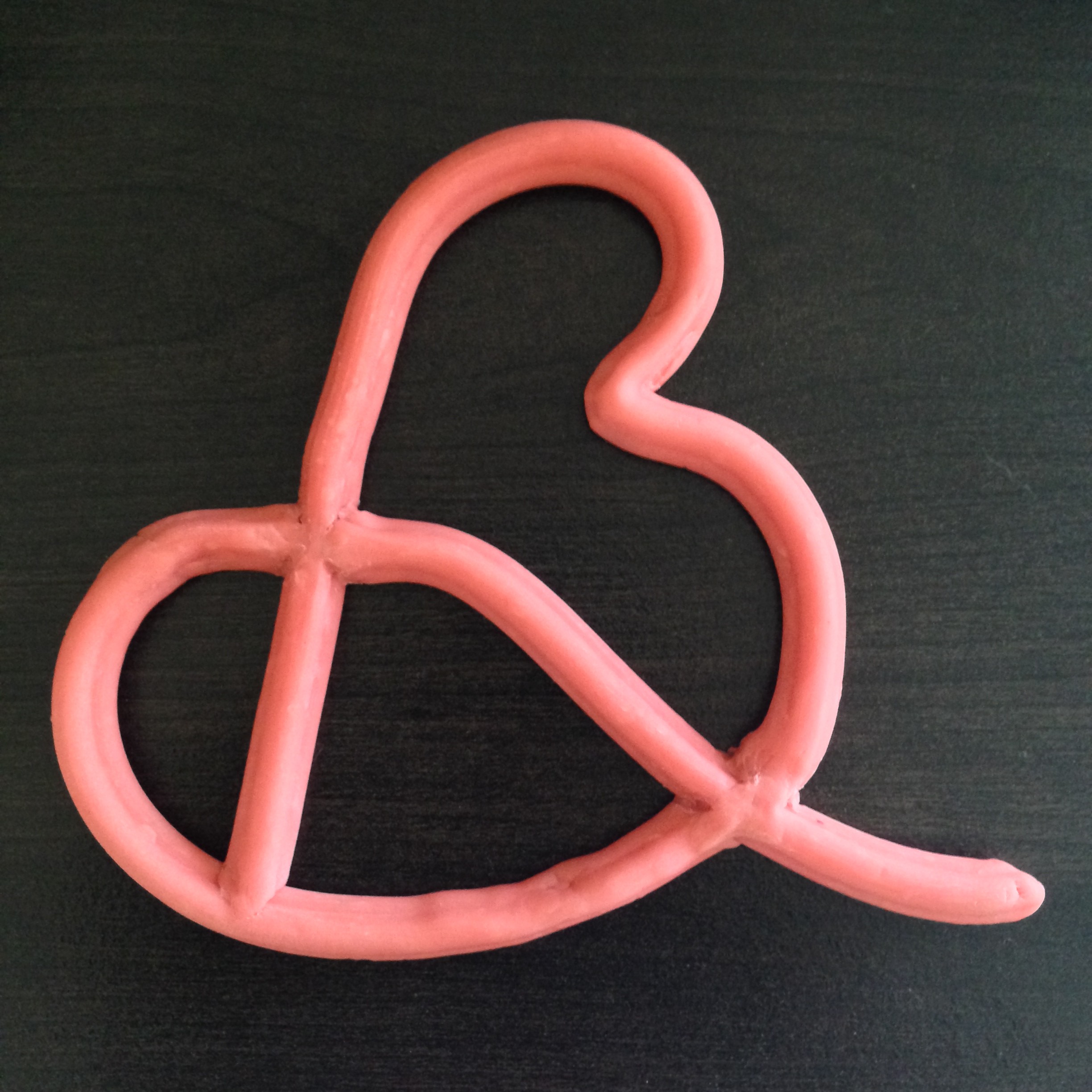
Letter B
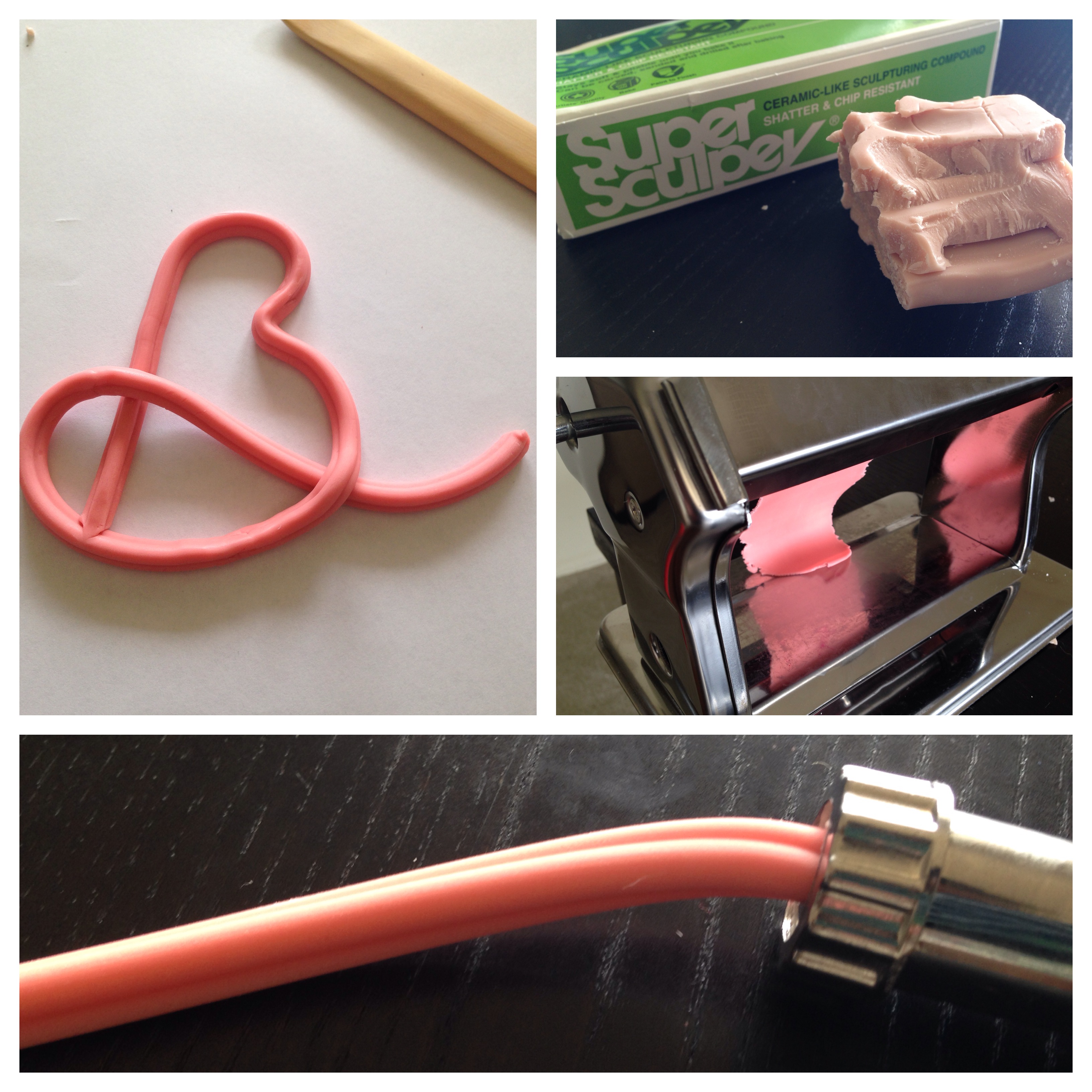
Continuing with my alphabet challenge, last week’s offering was the letter B. Again, I went for a handcrafted option. When I brainstormed ideas for the letter B and what I could do with it, my first thought was baseball script. There is a flow and energy to it that is both exciting and nostalgic. What better to pair with baseball than bubblegum pink? I didn’t want to actually chew bubblegum to make the B, but I wanted it to have a bubblegum quality. To get that aesthetic, I opted to use Sculpey to craft the letter.
You can see the process above (starting in the top right and continuing clockwise). I began with plain Super Sculpey and added color to it using a brush pen. Constant rounds through Sculpey’s own Clay Conditioning Machine ensured that the color spread evenly. Then, I extruded the pink Sculpey using an extruder. Finally, I shaped the resulting cord of clay into the shape of the B I sketched. It was certainly a lot easier than the linocut! The final product is below. There could’ve definitely been more attention to the joining points, but I’m fairly pleased by the B.
As always, you can always search #myletterhalf on Sunday evenings if you don’t want to wait for this blog post. Also, make sure you check out Mitch’s B on Twitter.
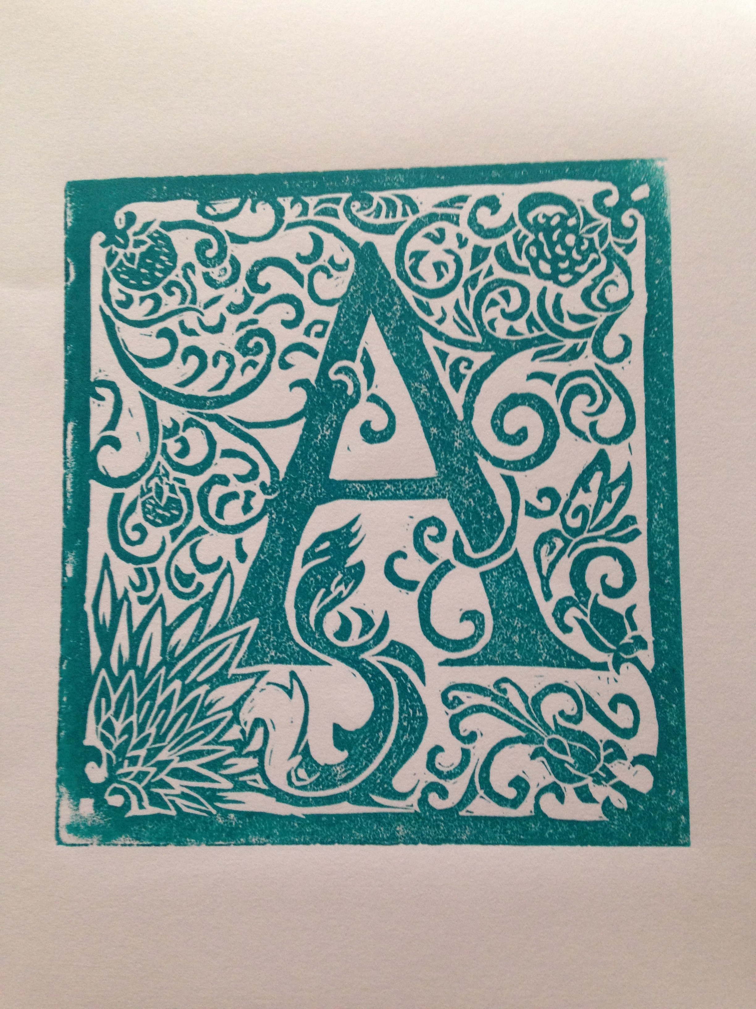
Letter A

My friend Mitch and I revealed our initial alphabet challenge pieces on Twitter yesterday. It was an exciting moment for me because I would be able to see his thought process versus mine. By being so open with this project, I thought we would both have very different ideas, but we both created prints—me with a linocut and Mitch with an apple. Above is an image detailing my process. After cutting my block, I inked my linoleum and printed by hand with a spoon (notice that buff edge!). It was a bit of a trip down memory lane, because I had forgotten much of the printing process.
I wanted my A to feel like a very fancy drop cap. I added as many curves, flourishes, and small details as I could with linoleum. It was fun to form everything by hand instead of tweaking anchor points in Illustrator. Below is a better photograph of the A. I will post the letter B next week, but you can always search #myletterhalf on Sunday if you don’t want to wait.
From A–Z
Recently, I’ve noticed a lot of designers challenging themselves to create more. Many of these are simple, daily tasks, but others are competitive bouts. Drawing inspiration from several avenues—Typefight being a major one—I decided that I would challenge myself to create one letter of the alphabet a day.
After discussing my idea with my friend, Mitch (and convincing him to take part in my challenge as well), we changed the time limit to three letters a week. However, this ended up being a lot more time consuming than I originally imagined, so we are going to create one letter a week with our reveals to one another on Sundays via Twitter. Maybe after twenty-six weeks, we’ll be so over this project that we hate it, but if not, we will potentially move on to numbers.
All of that being said, I will post each letter here on Monday mornings, so make sure you check back for the letter A.
Easter Crafts 2014

When holidays roll around, I tend to go all out with a fun baking or craft project. It’s a great excuse to get my hands dirty and learn something new. To make up for my lack of crafting last year, I made two treats—Easter eggs and lemon “tassies.” (more…)